Watercolor
|

|
Exhibition Text
“Sins of the Father” is meant to comment on the patriarchal ownership of women, and the tradition of the father passing down ownership to the husband in wedding ceremonies. This piece was influenced by Albrecht Dürer’s “Self-Portrait at the Age of Twenty Eight” and John Singer’s “The Lady With the Umbrella”. Certain components from each piece, such as the medium of watercolor and the portraiture style, were areas of inspiration for my piece. All objects used to create this piece were purchased.
Inspiration
|
Self-Portrait at Age of Twenty Eight by Albrecht Dürer
"Self Portrait at Age Twenty Eight" is unique in the sense that is is one of the first self portraits ever created. Self-portraiture became prevalent during the age of the Renaissance, and went on to influence much of Western art. While the main focus of this piece was to explore a new genre of painting, Dürer also intended to experiment with texture and color composition. He wanted to expand his technical skills by experimenting with hair texture, and was able to portray his natural hair type perfectly in the self-portrait. Dürer also experimented with a dark color palette, utilizing mainly reds, browns, and deep yellows. Dürer also utilized line in this piece, emphasizing the shape of his form with dark brush strokes. Dürer composed this painting in such a way that the viewer's eyes travel from his face, down his robe and onto his hands. This composition was intended to place an emphasis on the new genre of self-portraiture, as the main focus of the piece is Dürer's face. |

|

The Lady With the Umbrella by John Singer Sargent
John Singer Sargent's "The Lady With the Umbrella" is part of a series of paintings that captured various female figures in Sargent's life. This piece happens to be a portrayal of his niece, Rose-Marie Ormond. Singer utilizes a bright color composition in order to create emphasis on the natural beauty of the women he portrayed. In depicting her in a natural setting, in clothes that were considered very fashionable during that time period, Singer is referencing themes of youth and innocence. Singer also utilizes line in order to draw the viewer's eyes to the natural form of the woman, as well as the subject of the title: the umbrella. Soft, smooth brushstrokes were used in order to create the flowing shape of the woman's dress. Lastly, Singer designed folds in the dress in order to emphasize shape and form.
John Singer Sargent's "The Lady With the Umbrella" is part of a series of paintings that captured various female figures in Sargent's life. This piece happens to be a portrayal of his niece, Rose-Marie Ormond. Singer utilizes a bright color composition in order to create emphasis on the natural beauty of the women he portrayed. In depicting her in a natural setting, in clothes that were considered very fashionable during that time period, Singer is referencing themes of youth and innocence. Singer also utilizes line in order to draw the viewer's eyes to the natural form of the woman, as well as the subject of the title: the umbrella. Soft, smooth brushstrokes were used in order to create the flowing shape of the woman's dress. Lastly, Singer designed folds in the dress in order to emphasize shape and form.
Planning
|
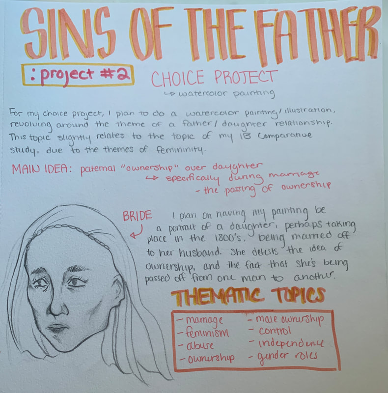
For my first planning page, I laid out my initial ideas for the project. Due to my recent work on my IB Comparative Study, I knew that I wanted to focus my project on themes of femininity, the female experience, and human form. Additionally, I wanted to focus on portraiture as my Comparative Study does specifically pertain to female portraiture. I decided to focus on the topic of male ownership, and the tradition of the father walking his daughter down the aisle in order to pass on ownership to her future husband. I wanted to depict the woman as unhappy, in order to really emphasize her lack of control and the status of her father as an authority figure. I detailed all of these ideas and themes and drew a small planning sketch of an idea that I had for the composition of the painting.
|
|
|
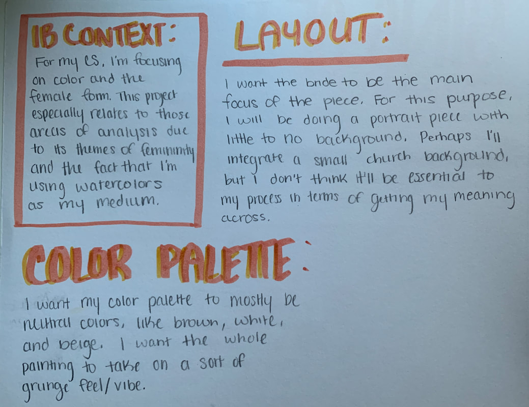
On my second planning page, I detailed the layout that I intended to do for my painting, as well as the connection between my painting and my Comparative Study, and the color palette that I planned out for the painting. I described the portrait style of composition that I wanted to do for this painting, as well as why I wanted to do that layout. As was mentioned above, I wanted to do a portrait style of painting so that the bride was the main focus of the painting. As for my IB Comparative Study context, I felt as though it was relevant to reference because the idea behind my painting came from wanting to focus on themes of femininity, which is the subject of my CS. Lastly, for my color composition, I explained that I wanted to do a dark color palette, similar to "Self Portrait at Age of Twenty Eight" by Albrecht Dürer.
|
|
For my third and final page, I decided to plan out my final sketch before beginning the painting process. I referenced the planning that I had done earlier by formatting my layout in a portrait style. Additionally, I tried to plan out my color composition, and the specific shades that I wanted to use, as well as where I planned emphasizing any shadows on the female form. Overall, my previous planning pages had a large influence on my final sketch and the way that I chose to format it. As this was my last planning page, I immediately followed this step with the beginning of my actual painting process. |

|
Process
|
I laid out my painting and began to start on the skin. I started with a soft off-white base, so that I could layer darker colors on top. Once I finished blocking the color on the face and neck, I started to add shadows on areas of natural darkness. These areas included the jawbone, cheekbone, chin and eye sockets. I wanted the light in the painting to be coming from the right, so the left side of the face was where the shadows would be located. I started to layer soft browns and yellows on top of the off-white base, emphasizing the shape of the face. I avoided painting any areas like the lips and eyes until I had finished with the main face, as those specific areas tended to be more detailed and therefore required more individual attention.
|

|

Once I finished with the skin tones of the face, as well as the lips and eyes, I worked on painting the woman's hair and dress. I had intended for her hair to be dark, in order to create contrast between the face and the dress. In order to create hair texture, I utilized the technique of small, short, thin brushstrokes. This was especially useful in depicting the woman's bangs. Separately, I decided to stray from the traditional white wedding dress. Due to the fact that my painting was commenting on a negative issue in society, I wanted the dress' composition to reflect that. Therefore, the off-white, yellow and gray toned dress is meant to represent unhappiness in marriage as well as the lack of control that women have had throughout eons of arranged and forced relationships.

|

|
|
After I painted the wedding dress, I filled in any additional details I had to make on the portrait. This included the red flowers on the crown of the veil, as well as the pearl necklace. After I finished with the details, I used a black liner pen to go over any significant lines that I wanted to define. I did this with the purpose of emphasizing the shape and form of the bride. Additionally, the liner pen helped me add even more minute details to the final piece; for example, I was able to use it to fill in the eyebrows and the lines on the lips of the woman. Once I finished outlining, I mixed several different paint shades together in order to create a deep blue shade for the background. I picked this color because I wanted to create contrast between the actual woman and the background; I felt as though a contrasting background would draw more attention to the subject of the painting.
|

|
Experimentation
|
The very first experimentation that I did was an initial sketch of my idea for the project. I had sketched out my idea for a bride walking down the aisle, being led by her controlling father, which was symbolized through his hand on her shoulder. Once I got to the painting process, however, I realized that I wasn't going to be able to produce a quality piece due to both my technique and the brand of watercolors that I used. Technique wise, my initial base was incredibly yellow and clashed with the natural skin tones that I wanted to portray in the bride. In terms of watercolor brand, I deduced that the brand of watercolors that I was using was too pigmented for my purposes, and I decided to transition to a different brand.
|

|
|
The brand I initially used in my first sketch was Koi watercolors. As mentioned above, I decided not to use this brand as it was too pigmented, however, I also decided to stray away from it because I wanted to acquaint myself with another brand that I hadn't quite used yet; therefore, participating in experimentation with various watercolor brands. The brand that I ended up using in my final sketch was Prang watercolors.
|

|

|

|

|
The last part of my experimentation involved the use of black ink pens. While I'm familiar with the material, I mainly have used it in the past with simple sketches, rather than a large painting. However, in this case, I wanted to emphasize shape and form in a clean, smooth manner, which led to the use of ink pens. Initially, I had trouble with the ink pens, because the watercolors were difficult to line over without the pen drying up due to the texture of the paper. Because of this issue, I was forced to seek out and experiment with multiple different pens. Eventually, I found one that didn't have the same drying up problem as the other pens. This experimentation was essential to my process, as it gave my painting a smoother and cleaner look overall.
Critique

Self Portrait at the Age of Twenty Eight by Albrecht Dürer
|

The Lady With the Umbrella by John Singer Sargent
|

Sins of the Father (my piece)
|
Similarities
Beginning with the similarities between my inspiration and my piece, the most obvious is the medium of paint. I took inspiration from Dürer and Sargent's use of watercolor in their paintings, as well as the various painting techniques that were used. More specifically, I utilized Sargent's technique of light brushstrokes in order to create shape and form. I tried to emphasize the shape of the veil with light strokes of the brush, as Sargent did. In terms of similarities with Dürer, I tried to embody his use of line. While I did use an outlining pen to emphasize my lines, I also used dark pigments of paint, similar to Dürer, and his specific style of watercolor painting. Another similarity between my piece and Dürer's piecec is the color palette. I wanted to embody a dark composition, very similar to Dürer's work. I focused on shades of yellow and red, as well as white, which are all colors that are very prominent in "Self Portrait at the Age of Twenty Eight". Separately, one similarity between my piece and Sargent's piece is the stylistic choice of clothing and the portrayal of women in portraiture. I took inspiration from Sargent's decision to portray his niece in a white, ballroom gown style of dress. Additionally, both my piece and Sargent's piece focused on the representation of women in portraits. Lastly, one prominent similarity between all three pieces is the decision to explore the genre of portraiture in our artwork.
Differences
One obvious difference between all three pieces is the choice of subject. Dürer chose to do a self-portrait, Sargent chose to portray his niece, and I chose to depict an insignificant bride. While all three pieces can be designated as portraiture, none of them can be connected by a specific subject. More specifically, one difference between my piece and Dürer's piece is the choice of background composition. Dürer's portrait features a deep, black background, that was intended to draw the viewer's eye towards the subject of the piece. Alternatively, I chose to utilize a deep blue background, in order to create contrast without washing out the main subject of the piece too much. Additionally, Dürer chose to portray much of the upper body, including his arms and hand, while I chose to simply portray the upper chest and head of my subject. Finally, Dürer's piece has more of an emphasis on light, and how light affects form, while my piece didn't place an emphasis on lighting nearly as much. Separately, one difference between my piece and Sargent's piece is the color composition. Sargent composed his painting with bright, soft colors, such as green, white and pink. Alternatively, I chose to utilize a deep color composition, mainly focusing on shades of red, yellow, black and blue. My painting is also much more washed out compared to Sargent's, taking on a more yellow undertone. Additionally, Sargent did not place an emphasis on line in his piece, and mainly focused on using faint brushstrokes in order to create form. I chose to utilize an outlining pen, that helped me to emphasize specific areas of focus.
Reflection
Overall, I'm happy with how the project turned out. This was somewhat of a challenge for me, as I hadn't used watercolors in almost a year. Therefore, I was forced to rediscover some of the techniques and skills that I had lost in the time that I had abstained from this medium. At first, I was upset with the process, because I had become out of touch with the medium that I had been using for many years. However, I think that experimenting with the paints and re-learning the technique has helped me develop more as an artist, and I was able to reflect on my process in a way that will help me improve my skills in the future. My inspiration was very significant in helping me re-connect with my medium, simply because I was able to analyze their works, and gain some insight into the specific techniques that they used while working with watercolors: for example, light brushstrokes and placing an emphasis on line. Additionally, this project helped me to clarify some differences between the two mediums of paint that I have used so far in projects: watercolor and acrylic. In a previous painting project, I used acrylic paint in a self-portrait. After doing this project, I realized that I had to use different techniques when using watercolor, compared to acrylic. Acrylic paint is much easier to blend, and dries slower. Alternatively, watercolor dries quickly and can be hard to blend, depending on the type of paper that is used. Discovering these differences was one of my favorite parts of this project, as I knew it would help me in the long run. Overall, I'm happy with the outcome of this project, and my ability to return to watercolor paints after so long.
Connection to the ACT
1. Clearly explain how you are able to identify the cause effect relationship between your inspiration and its effect on your artwork?
My inspirations were Albrecht Dürer and John Singer Sargent; Dürer utilized line to emphasize form while Sargent utilized light brushstrokes in order to accurately portray shape. Both techniques were used in my piece.
2. What is the overall approach the author has regarding the topic of your inspiration?
Portraiture is particularly unique in its ability to convey meaning, specifically regarding the experience of women due to generations of persecution and oppression.
3. What kind of generalizations and conclusions have you discovered about people, ideas, culture, etc. while you researched your inspiration?
Watercolor paints are a difficult medium, but they are unique in their ability to define form while still appearing thin and smooth, compared to layered, and heavy styles of paint, such as acrylic.
4. What is the central idea or theme around your inspirational research?
Women have been controlled unwittingly for generations, and that is especially prevalent in prominent marriage traditions, such as the father handing off the daughter to her husband.
5. What kind of inferences did you make while reading your research?
Line can completely change a piece, through its ability to emphasize form and shape. It can also be used to give an artwork a cleaner look overall.
Citations (MLA Format)
“Albrecht Dürer, Self-Portrait (1500) – Smarthistory.” Smarthistory.org, smarthistory.org/albrecht-durer-self-portrait-1500/.
Catalunya, Agència Catalana del Patrimoni, Generalitat de. “The Lady with the Umbrella.” Visitmuseum · Catalonia Museums, visitmuseum.gencat.cat/en/museu-de-montserrat/object/la-dama-de-l-ombrel-la. Accessed 15 Feb. 2023.
